Thursday, March 24, 2016

A Drool Worthy Kitchen Remodel


I don't like to play favorites with my projects, but every now and then a project comes together in such a way I can't help but want to put it in a tiny bottle and hang it around my neck so I can look at it whenever I want. Of course I realize this concept is totally unrealistic as no one kitchen is going to go with all of my outfits, so instead I write blog posts about them for all to enjoy.

In all seriousness I really have a treat for you guys today! I truly feel like kitchens like this are the reason why people (including myself) just can't resist a white kitchen. Elegant, classic, bright, happy.....so many adjectives, so little time. Let's dig in...

I first met this kitchen in the summer of 2014. The homeowner has great taste and the entire house and property is just beautiful, but the kitchen had never been touched. I so wish I had a before picture of this space, but I don't....Architecturally speaking the kitchen has really great bones with the beams and the skylights, but it was time for a more refined and updated look for this family.

This kitchen is unique in that every wall of this space is a focal in and of itself. There are four entrances into the kitchen from other parts of the house, so it was important to give each side of this kitchen it's own dose of personality, balance and beauty so regardless of which way you enter the room, something pretty is in your line of sight. The kitchen is separated from the family room by a two-way stone fireplace. You can see the mantle poking out in the picture below.


While the fireplace acts somewhat as a boundary line I love the fact that you can see around and through the fireplace into the family room or vice versa, into the kitchen, making this space feel like one big room. Cabinetry speaking, there really are two strong focal points in the actual kitchen space of this big room - the hood wall and the window wall. Luckily the size of each wall allowed for the cabinetry to have great balance. 

Here is a shot of the window wall. This is the view you would have entering the kitchen from the dining room and front hallway. 


The original window was removed and replaced with this much larger window. I love the natural light that pours into the kitchen, both from this window as well as the skylights above. The sink was centered on the window and we designed wall cabinets down to the countertop and a wooden valance to frame in the window on all four sides. The homeowner picked out some pretty sconce lights that coordinated with the large pendant lights that hang over the island. The lights were installed on the side of each wall cabinet which really helped accentuate the beautiful window and sink.

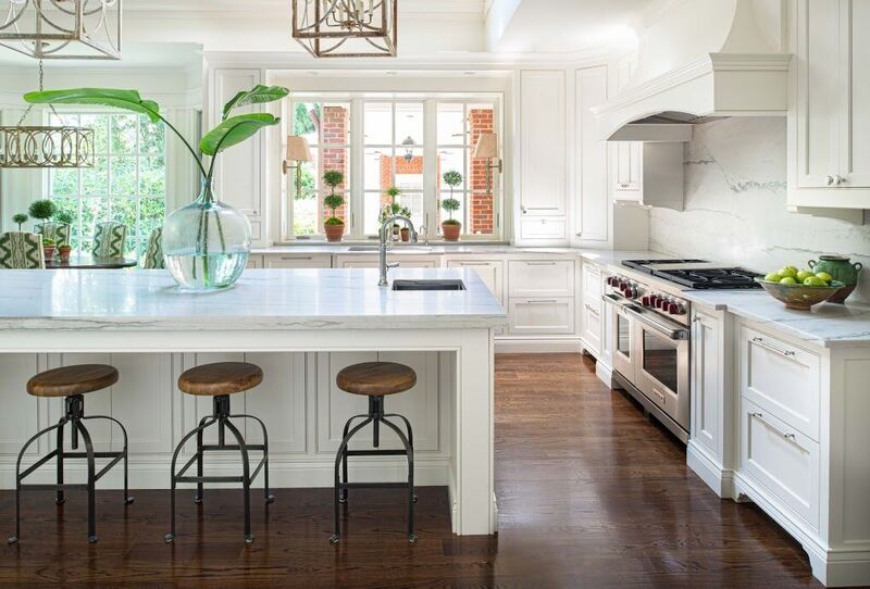
The custom hood was centered on the back wall over the 48" range. 


As I said, because of the dimensions of this wall, the cabinetry flanking the range was not only functional but symmetrical. Spice and crock pullouts as well as large pot drawers were designed to go  on each side of the range. And wall cabinets with custom brackets were designed to hang on each side of the hood. Symmetry really is a kitchens best friend. 

Across from the window wall sits the refrigerator wall. 


A refrigerator column and freezer column were centered on the wall. While the units themselves are only 84" high we made the wood appliance panels much higher to create a cool visual. The space above the refrigerator was covered with a finished panel so when you open the door to either unit, everything is nice and finished inside. Tricks like this make the appliances feel more like a piece of furniture. We kept all cabinetry on this wall tall so as to provide more storage. The microwave sits on a shelf inside the far right tall unit, so it's within reach when needed without being an eye sore. 

Each and every cabinet was considered. From rollouts and two trash cabinets to a LeMans blind corner cabinet and spice and crock pullouts, we made the most of every piece of storage. All cabinetry is inset bead from Bell Kitchen & Bath Studios Signature collection. And while this space looked beautiful once we did our part the homeowner really brought everything to life with her tasteful styling and elegant touches. As soon as you step into this space you feel happy and that my friends is what a successful kitchen remodel is all about. 

Photography by Galina Coada for Bell Kitchen & Bath Studios. 

Sunday, March 13, 2016

About.com - February Recap


Hi peeps! Every time I do one of these About.com recap posts I am reminded just how fast time goes by! It is hard to believe we are already 13 days into March...wasn't it just Christmas? Didn't I just have a baby? It will be summer before we know it! Anyways, last month I got back into my writing groove and posted 6 new articles and updated 5 posts over on my About.com Kitchens page and there are some pretty good topics if I do say so myself #sohumble

First up...


The topic of cookbook storage almost always comes up in design meetings with my clients. Regardless of how good you cook, often you cook or what you cook...if you have cookbooks you want them readily available in or around the kitchen, otherwise it is highly unlikely they will be reached for. 


I love a window or windows in the kitchen. Not only is natural light the best light, but there is a lot you can do design wise to really play up the windows in your space instead of simply working around them.  


Now THIS, this is a question or a conversation I feel like I have regularly with clients. Should the kitchen cabinets go to the ceiling or not? Of course the answer depends on several factors, but at the end of the day the biggest influencer is going to be your ceiling height. In this article I discuss the options or best practices if your ceilings are 8 foot, 9 foot, 10 foot and beyond. 


There is something refreshing and relevant about modern design right now, but so many of us prefer to admire this look from the sidelines instead of incorporating it into our own homes. In this article I discuss a few ways you can integrate modern accents into your space in way that will enhance your vibe, not confuse it. 


Your eyeballs love repetition. Did you know that? It's true, the eye is naturally drawn to repetition in all things and the kitchen is no exception. This article is full of ideas for playing with repetition in your space. 


Blush is everywhere right now! Here I talk about a few ways to add this hot color to your kitchen. 


Updated Articles:

Thursday, March 3, 2016

Back in the Saddle


I started back to work this week. 

It blows my mind how quickly my maternity leave flew by and how accustomed I got to my new Mom routine. It feels strange leaving the house each day without my little pal Croix in tow. While I would love to just buy a tiny hard hat and strap him to my back as I get back to my projects, I feel that would be frowned upon by OSHA. So, instead Croix stays with a nanny and a little girl who will be two in April...his first friend (awww!) and I go to work, looking at his little smiley face on my phone 3432423432 times a day and looking forward to picking him up each afternoon. 

On the work front, ready or not I dove back into the real world head first this week, as a project I designed last Fall installed Sunday night at Phipps Plaza. That's right, myself and Bell Kitchen and Bath Studios (the company I work for) have designed the kitchen for Atlanta Homes and Lifestyle's Luxury Living Show again this year. This is the kitchen that sits in the middle of the mall. Bell has done this kitchen seven times and of those seven times,  this is my fourth year being involved and my third year as the lead designer.

You may remember my first kitchen...the blue kitchen...

Photo from Atlanta Homes & Lifestyles
and then last year's Southern Modern design:

Photo from Atlanta Homes & Lifestyles


This year I really wanted to go for something a bit fancier. Not stuffy, just elegant with classic Atlanta style and grace, plus a little unexpected flair. I had to get the wheels turning on this bad boy early since I knew I wouldn't be designing the first two months of the year. So, last fall I sat at my kitchen table and doodled up my vision: 


Our crew went to work installing the kitchen Sunday and Monday night. Because the kitchen is in the mall, they have to work through the night when the mall is closed (best crew ever!). Tuesday the finishing touches were added and the magazine did their photo-shoot and last night was the opening party.

Here is a photo I snapped on my phone of the finished product yesterday:


The kitchen will be on display in Phipps Plaza for the month of March. There will be several events hosted at and around the kitchen over the next four weeks including the Design Bloggers Conference and an NKBA (National Kitchen and Bath Association) event where I will be speaking on a panel...eek! We are having the kitchen photographed tomorrow so I will be back soon with a post full of pictures of the kitchen, more behind the scenes design details and the list of all of the collaborators that come together to make this beast come to life. Until then, you can see a few more sneak peeks over on my instagram!

Unless otherwise noted all photos are my own.